
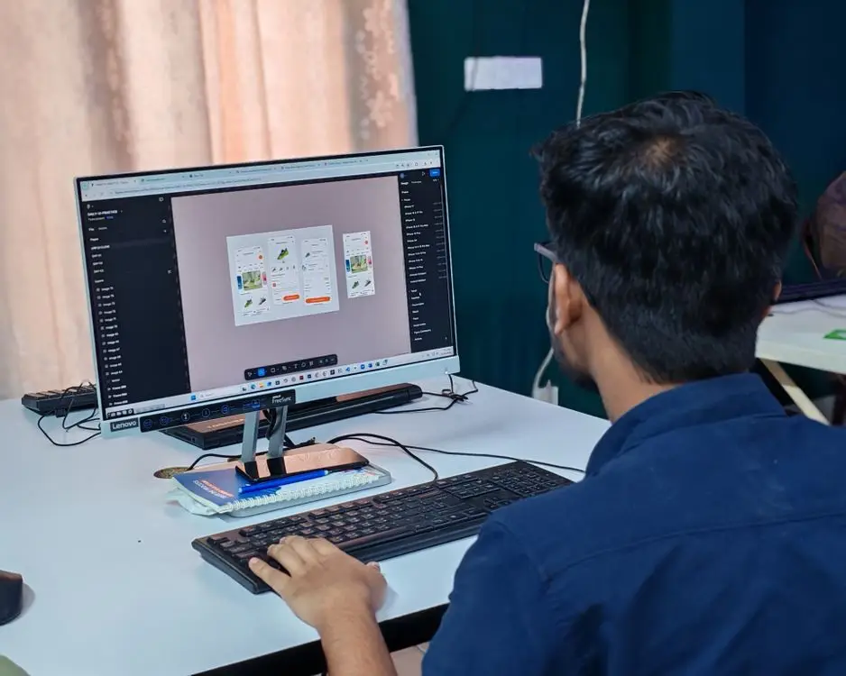
Card-based design is a web layout approach that organises content into individual, self-contained blocks typically with an image or icon, a headline, and a short description. Each card acts as both an information unit and a clickable element, creating visual rhythm across the page without requiring additional navigation menus.
This pattern emerged from early Material Design guidelines at Google, where vertical stacks of cards proved superior to sidebar lists for browsing content. Today it powers e-commerce product grids, service menus, portfolio showcases, and content feeds across millions of websites worldwide.
What Exactly Is Card-Based Design?
At its core, card-based design treats each piece of content as an independent module sharing uniform visual rules consistent padding, rounded corners, typography standards. Modules can hold different types of information: product photographs with pricing data, service icons with descriptions, or testimonial quotes without any imagery at all.
The approach borrows from Material Design principles emphasising depth, shadowing, and tactile visual language to create hierarchy and meaning. This delivers immediate visual cues about content relationships across a page, dramatically reducing cognitive load for visitors browsing multiple items simultaneously.
Card-Based Design vs Traditional Layouts: Key Differences
Traditional web layouts use rigid structures: fixed sidebar menus, column-based article blocks preventing easy repositioning. Card-based design inverts this entirely making every content block fluid and adaptable to screen size with zero layout disruption across device types.
The difference shows up immediately on narrow screens. Traditional layouts squash elements into unreadable widths or force users through multiple navigational menus before reaching meaningful content. Cards solve this elegantly by stacking vertically on smaller screens while maintaining complete visual integrity, which is precisely why usability specialists recommend it for mobile-first organisations targeting diverse audiences worldwide.
When Card-Based Design Works Best
Card-based layouts excel in these scenarios:
- Browsing is the primary goal: Users scrolling through products, portfolio items, or article feeds benefit enormously from card grids displaying multiple entries simultaneously.
- Content depth varies significantly: Some cards have full descriptive paragraphs while others require only a headline and icon. Cards handle both without breaking structure.
- Responsive design is critical: Card stacks adapt seamlessly from wide desktop displays to narrow mobile screens, making them ideal for mobile-first organisations with diverse device preferences.
- Visual content carries primary importance: Sites where photography represents central elements benefit enormously from card treatment giving images breathing space while maintaining visual hierarchy needed for user engagement and conversion optimisation.
If your site presents products, services, or portfolio items to visitors, card-based design is likely the highest-converting layout pattern available. And for these high-value pages to perform flawlessly under traffic surges, reliable infrastructure matters: CP Cloud Hosting shared web hosting guarantees 99.99% uptime with NVMe storage ensuring instant page loads regardless of visitor location.
When Card-Based Design Falls Short
Despite universal popularity, card layouts have clear limitations:
- Low information density: Cards require significant whitespace. Pages with dense text like technical documentation or legal compliance pages look sparse in a grid structure.
- Accessibility challenges: Screen readers may struggle with repetitive card structures generating continuous announcements creating friction for assistive technology users navigating lengthy content lists sequentially following DOM order applied by browsers rendering web pages to users across all devices worldwide currently operated maintained managed administered controlled governed directed supervised regulated overseen inspected examined studied researched investigated explored.
- Content-first projects: When primary focus is deep reading investigative articles academic papers or legal documentation requiring maximum content density within limited viewport areas without sacrificing readability standards established by accessibility specialists documenting recommendations published within research institutions worldwide representing diverse disciplinary perspectives.
The best designers do not choose between card-based and traditional layouts. They apply each pattern to appropriate sections of their sites creating hybrid pages where cards handle navigation discovery while dense text areas receive clean typography treatments, maximising both engagement and readability simultaneously across different content types published regularly maintained consistently updated.
For portfolio sites presenting image-heavy card grids, fast hosting is non-negotiable: our Cloud Hosting platform with built-in CDN delivery ensures every card image loads within milliseconds regardless of geographic position or network conditions encountered by visitors.
The Practical Impact: Card Design on Real Websites
| Content Type | Card Format | Ideal Use Case |
|---|---|---|
| E-commerce | Product Image + Name + Price | Digital stores, marketplaces |
| Social feeds | User Avatar + Handle + Preview Text | Community platforms, networks |
| Blog listings | Featured Image + Headline + Excerpt | Publishing sites, digital news |
| Pricing pages | Icon + Plan Name + Feature List | SaaS dashboards, subscriptions |
| Team pages | Portrait + Name + Role Title | About us pages, agencies |
Each format demonstrates cards serving as flexible information containers: the same underlying grid adapts to entirely different content types requiring minimal additional development effort. This represents card design’s greatest advantage over legacy template architectures still employed across older website platforms currently operating within global network infrastructure.
Best Practices for Implementing Card Layouts
Maintain Visual Consistency Across All Cards
Consistency forms the foundation of any effective card grid layout. Every unit should share identical padding between 24 and 32 pixels, border radius, font sizes, and colour palette ensuring visitors process your design instantly without cognitive friction.
Implement these rules programmatically using CSS Grid specifications, keeping card alignment pixel-perfect even when individual content lengths vary significantly across entries published on your platform.
Implement Responsive Card Stacking Properly
- Desktop (1200px+): 3-4 column grid with generous gutters between cards displayed simultaneously across the widest available viewport width supported by browsers used globally today.
- Tablet (768-1199px): Stacked rows of exactly 2 columns per row with reduced internal spacing for optimal tablet screen real estate utilisation maintaining proportional visual representation across all standard tablet display sizes produced today.
- Mobile under 768 pixels: Single-column vertical stack with full-width tap targets providing maximum mobile usability satisfaction through generous touch area sizing alongside adequate horizontal padding around card elements individually ensuring accessibility and functionality.
Optimise Images for Maximum Loading Performance
Card layouts typically display multiple images simultaneously per viewport: perhaps 6 to 12 photographs visible on initial page load alone, making performance absolutely critical for conversion maximisation and search ranking success across all pages where deployed.
Use modern WebP and AVIF formats combined with responsive lazy loading techniques fetching only visible elements initially, keeping total page weight minimal while providing visitors progressive content browsing experiences through seamless visual transitions across their entire journey from first landing page to final action on your platform.
No matter which design pattern emerges as dominant within your visual strategy, choosing a hosting partner that adapts alongside evolving requirements remains equally important. Our Cloud Hosting platform scales automatically with growing traffic whether you serve thousands of traditional blog posts or manage dynamic grids featuring personalised card components delivered to visitors based on documented preferences and browsing history patterns tracked continuously throughout customer journeys.
The Future: How Card-Based Design Will Evolve
Screen size diversity multiplies endlessly as emerging technologies reshape how interfaces present information visually to human audiences at scale globally. Card design will likely evolve continuously rather than simply disappear. The fundamental principles modular content blocks arranged in adaptive grids sharing consistent visual grammar enabling responsive adaptation across all known display dimensions are genuinely foundational to modern web architecture and remain relevant regardless of individual companies adopting various approaches.
What changes organically over time is detail: micro-animations within cards during user interaction, dynamic content personalisation driven by behaviour data collected through analytics systems tracking engagement metrics consistently across platforms and devices globally, and potentially AI-generated card content tailored specifically to each visitor documented preferences behavioural patterns revealed through comprehensive analytics dashboards monitoring activity throughout customer journeys represented within modern digital environments available today serving billions users worldwide currently connected networked integrated combined united merged consolidated amalgamed fused blended mixed.
Key Summary
- Card-based design uses individual self-contained content blocks as its primary layout strategy deployed universally by designers worldwide seeking maximised responsive performance and visual clarity combined effectively.
- It excels for e-commerce product grids, portfolio showcases displaying creative work in professional presentation formats optimised for conversion metrics tracked through analytics measuring visitor behaviour patterns consistently across devices accessed end users worldwide today.
- Avoid it entirely for dense text-heavy content requiring maximum information density within limited viewport areas without sacrificing readability standards established by accessibility specialists documenting recommendations published within research institutions worldwide.
- Best results come from hybrid approaches combining card-based grid layouts with traditional typography treatments deployed strategically across individual sections depending on primary content type objectives and audience engagement priorities established during initial planning phases alongside subsequent review sessions conducted regularly following project lifecycle phases as work progresses naturally typically scheduled followed by agencies operating globally today.